Exploring the NYCDOH Covid Dataset
Exploring the NYC Dept of Health’s Covid Dataset
Introduction and Timeline
The Covid-19 Pandemic of 2020 is an event that will forever change our lives. At the time of writing this, there is a potential second lockdown in the horizon for NYC. Let me walk you through a few events and how I got to the point of working on this data. On Thursday March 12th 2020 the superintendent of the school my kids attended announced that beginning on Monday March 16th, their school would be closed due to caution of the Covid-19 outbreak until further notice. There would be added stress at home with my kids now at home, we would most likely have to pay for childcare and didn't know how we would go about dealing with this extra expense, and I was literally days away from completing my Masters. Before we could settle on a decision on how to move forward, the citing began shutting down until a full lockdown was in place. That Monday, when I arrived at work I was sent home and told my office was working remotely until further notice for the same reasons. Childcare would no longer be an issue since I was also home, but how would I work? Things were still up in the air, but all I kept saying was let me get to class on Thursday night and Ill have one huge stress off my shoulders. My wife decided she would stay home temporarily for a few days while we figured everything out. Thursday finally came, I completed my degree but the celebration was short lived. On Sunday March 22nd at 8PM est NYC began its "Stay-at-home order" It was a ghost town for a few days, cases and deaths were going up and one couldn't help but feel hopeless during all of this. I no longer worked in the medical field and I was not a first responder so I didn't know what I could do to help fight this and bring my world back to normalcy. I knew eventually research scientists would begin creating some models to predict infection rates, we literally spoke about this in class not long ago, but this is not something I had access to. Over time some data sets began to emerge. First there was the COVID-19 Dashboard by the Center for Systems Science and Engineering (CSSE) at Johns Hopkins University (JHU) https://coronavirus.jhu.edu/map.html and eventually the NYC Dept of Health's Data https://www1.nyc.gov/site/doh/covid/covid-19-data.page Initially I thought I would use this data to create some visualizations, maybe even my own model to see how my predictions faired against the experts. It was an exciting time and a way to cope with what was going on and potentially help. A month into working on the data I had created some visualizations but due to the overwhelming news on what was going on, I could no longer work on this data. I was sick of hearing about the virus without much progress in sight, we were all stressed at home, and I thought I needed a break from this. Around May, things began slowly but surely reopening in NYC as the number of cases, hospitalizations, and deaths dropped significantly. At this point I felt I missed an opportunity to work with this data in real time and thought maybe I would revisit in the future. With the recent upticks we have had in NYC, I decided it was time to look at the data again and compare what the experts are saying about the potential of lockdowns and where the trends are leading. The recent decision to close down NYC public schools announced on November 18th 2020 has left many upset, and the City and State are considering larger shutdowns of businesses which will further hurt an already battered economy here in New York City. Some believe government officials are doing the right thing, others believe the government is not doing enough, while others say they are doing too much. I AM NOT an expert on Covid-19, I am NOT a medical professional, but I wanted to look at the data to come up with my own conclusion.
Data Source
I decided to focus on what was going on in NYC at the time and focus on the NYCDOH's Data. I will explore the following data sets
- data-by-date looks at cases, hospitalizations and deaths daily across the five boroughs
- tests looks which looks at the testing that has been done across the city as well as positive test results (cases)
- data-by-modzcta looks at all the data by zipcode
import pandas as pd
import requests
import json
# Git Repo URL
url="https://github.com/nychealth/coronavirus-data/raw/master"
# import data sets
daily_data = f'{url}/trends/data-by-day.csv'
testing_data = f'{url}/trends/tests.csv'
zipcode_data = f'{url}/totals/data-by-modzcta.csv'
Census Data
I also wanted to get an accurate count of the NYC population from the census bureau's data. The borough population sizes in descending order are: Brooklyn, Queens, Manhattan, Bronx, and Staten Island. My reasoning to look this up is to note the population sizes. This information will be useful when comparing data for the various boroughs.
| age_group | borough | 2010 | 2020 projections | change_in_percent_2000_2010 | |
|---|---|---|---|---|---|
| 0 | Total | New York City | 8242624 | 8550971 | 3.74 |
| 2 | Total | Brooklyn | 2552911 | 2648452 | 3.74 |
| 4 | Total | Queens | 2250002 | 2330295 | 3.57 |
| 3 | Total | Manhattan | 1585873 | 1638281 | 3.30 |
| 1 | Total | Bronx | 1385108 | 1446788 | 4.45 |
| 5 | Total | Staten Island | 468730 | 487155 | 3.93 |
Cases, Hospitalizations, Deaths
Once the daily data was imported, I saw that in addition to a tally of the total cases, hospitalizations and deaths, there was a break down by borough. This is great because it would allow me to visualize the data by borough.
# create daily counts dataframe for cases, hospitalizations, deaths
daily_df = pd.read_csv(daily_data)
# turn into a time series
daily_ts = daily_df
daily_ts['date_of_interest'] = pd.to_datetime(daily_ts['date_of_interest'])
daily_ts.head()
| date_of_interest | CASE_COUNT | HOSPITALIZED_COUNT | DEATH_COUNT | DEATH_COUNT_PROBABLE | CASE_COUNT_7DAY_AVG | HOSP_COUNT_7DAY_AVG | DEATH_COUNT_7DAY_AVG | BX_CASE_COUNT | BX_HOSPITALIZED_COUNT | ... | QN_CASE_COUNT_7DAY_AVG | QN_HOSPITALIZED_COUNT_7DAY_AVG | QN_DEATH_COUNT_7DAY_AVG | SI_CASE_COUNT | SI_HOSPITALIZED_COUNT | SI_DEATH_COUNT | SI_CASE_COUNT_7DAY_AVG | SI_HOSPITALIZED_COUNT_7DAY_AVG | SI_DEATH_COUNT_7DAY_AVG | INCOMPLETE | |
|---|---|---|---|---|---|---|---|---|---|---|---|---|---|---|---|---|---|---|---|---|---|
| 0 | 2020-02-29 | 1 | 0 | 0 | 0 | 0 | 0 | 0 | 0 | 0 | ... | 0 | 0 | 0 | 0 | 0 | 0 | 0 | 0 | 0 | 0 |
| 1 | 2020-03-01 | 0 | 0 | 0 | 0 | 0 | 0 | 0 | 0 | 0 | ... | 0 | 0 | 0 | 0 | 0 | 0 | 0 | 0 | 0 | 0 |
| 2 | 2020-03-02 | 0 | 0 | 0 | 0 | 0 | 0 | 0 | 0 | 0 | ... | 0 | 0 | 0 | 0 | 0 | 0 | 0 | 0 | 0 | 0 |
| 3 | 2020-03-03 | 1 | 1 | 0 | 0 | 0 | 0 | 0 | 0 | 0 | ... | 0 | 0 | 0 | 0 | 0 | 0 | 0 | 0 | 0 | 0 |
| 4 | 2020-03-04 | 5 | 2 | 0 | 0 | 0 | 0 | 0 | 0 | 0 | ... | 0 | 0 | 0 | 0 | 0 | 0 | 0 | 0 | 0 | 0 |
Lists of the data were created in order to plot the data, and from the list we can see that the date range for the data is 02/29/2020 to 11/19/2020.
# Create Lists for plotting
dates = daily_ts['date_of_interest'].tolist()
cases = daily_ts['CASE_COUNT'].tolist()
sevendaycases = daily_ts['CASE_COUNT_7DAY_AVG'].tolist()
hospitalizations = daily_ts['HOSPITALIZED_COUNT'].tolist()
sevendayhosp = daily_ts['HOSP_COUNT_7DAY_AVG'].tolist()
deaths = daily_ts['DEATH_COUNT'].tolist()
sevendaydeaths = daily_ts['DEATH_COUNT_7DAY_AVG'].tolist()
# Create borough Lists for plotting
# Bronx
bxcases = daily_ts['BX_CASE_COUNT'].tolist()
bxsevendaycases = daily_ts['BX_CASE_COUNT_7DAY_AVG'].tolist()
bxhospitalizations = daily_ts['BX_HOSPITALIZED_COUNT'].tolist()
bxsevendayhosp = daily_ts['BX_HOSPITALIZED_COUNT_7DAY_AVG'].tolist()
bxdeaths = daily_ts['BX_DEATH_COUNT'].tolist()
bxsevendaydeaths = daily_ts['BX_DEATH_COUNT_7DAY_AVG'].tolist()
# Brooklyn
bkcases = daily_ts['BK_CASE_COUNT'].tolist()
bksevendaycases = daily_ts['BK_CASE_COUNT_7DAY_AVG'].tolist()
bkhospitalizations = daily_ts['BK_HOSPITALIZED_COUNT'].tolist()
bksevendayhosp = daily_ts['BK_HOSPITALIZED_COUNT_7DAY_AVG'].tolist()
bkdeaths = daily_ts['BK_DEATH_COUNT'].tolist()
bksevendaydeaths = daily_ts['BK_DEATH_COUNT_7DAY_AVG'].tolist()
# Manhattan
mncases = daily_ts['MN_CASE_COUNT'].tolist()
mnsevendaycases = daily_ts['MN_CASE_COUNT_7DAY_AVG'].tolist()
mnhospitalizations = daily_ts['MN_HOSPITALIZED_COUNT'].tolist()
mnsevendayhosp = daily_ts['MN_HOSPITALIZED_COUNT_7DAY_AVG'].tolist()
mndeaths = daily_ts['MN_DEATH_COUNT'].tolist()
mnsevendaydeaths = daily_ts['MN_DEATH_COUNT_7DAY_AVG'].tolist()
# Queens
qncases = daily_ts['QN_CASE_COUNT'].tolist()
qnsevendaycases = daily_ts['QN_CASE_COUNT_7DAY_AVG'].tolist()
qnhospitalizations = daily_ts['QN_HOSPITALIZED_COUNT'].tolist()
qnsevendayhosp = daily_ts['QN_HOSPITALIZED_COUNT_7DAY_AVG'].tolist()
qndeaths = daily_ts['QN_DEATH_COUNT'].tolist()
qnsevendaydeaths = daily_ts['QN_DEATH_COUNT_7DAY_AVG'].tolist()
# Staten Island
sicases = daily_ts['SI_CASE_COUNT'].tolist()
sisevendaycases = daily_ts['SI_CASE_COUNT_7DAY_AVG'].tolist()
sihospitalizations = daily_ts['SI_HOSPITALIZED_COUNT'].tolist()
sisevendayhosp = daily_ts['SI_HOSPITALIZED_COUNT_7DAY_AVG'].tolist()
sideaths = daily_ts['SI_DEATH_COUNT'].tolist()
sisevendaydeaths = daily_ts['SI_DEATH_COUNT_7DAY_AVG'].tolist()
A function was also created that would give us the peak counts for the data sets and would let us know on what date they occurred
# create peakdates function to print out the count and date for each category where we want to look at peaks
def peakdates (count,dates):
maxcount = max(count)
peakdayindex = count.index(maxcount)
peakday = dates[peakdayindex].strftime('%Y-%m-%d')
print("The peak occurred on", peakday,"and had a count of", maxcount)
I wanted to check the date range and get the peak number for each figure I was interested in (cases, hospitalizations, deaths )
# Date range of data
print("The date range is",dates[0],"to",dates[-1] )
# Peak number of cases
print("For cases...")
peakdates(cases,dates)
# Peak # of hospitalizations
print("For hospitalizations...")
peakdates(hospitalizations,dates)
# Peak # of deaths
print("For deaths...")
peakdates(deaths,dates)
The date range is 2020-02-29 00:00:00 to 2020-11-23 00:00:00
For cases...
The peak occurred on 2020-04-06 and had a count of 6353
For hospitalizations...
The peak occurred on 2020-03-30 and had a count of 1835
For deaths...
The peak occurred on 2020-04-07 and had a count of 599
Next it was time to create some visualizations so we can see some patterns in the data.
import matplotlib.pyplot as plt #for plotting
import seaborn as sns
# Use seaborn style defaults and set the default figure size
sns.set(rc={'figure.figsize':(11, 4)})
#case count plot
ax = daily_df['CASE_COUNT'].plot()
ax.set_ylabel('Number of Cases')
ax.set_title('Total Covid-19 Cases in NYC')
# Second Cases Plot
fig = plt.figure(figsize=(20,6))
plt.xticks(rotation=45)
plt.title('Daily Covid-19 Case Count in NYC', fontsize = 22)
plt.ylabel('Daily Cases Count', fontsize = 14)
plt.xlabel('Dates', fontsize = 14)
plt.plot(dates, cases, color="blue", label = "Actual")
plt.plot(dates, sevendaycases, color="red", linestyle="dashed",label="7 Day Avg")
#plt.legend(bbox_to_anchor=(1.05, 1), loc='upper left', borderaxespad=0.)
plt.legend()
peakdates(cases,dates)
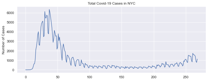
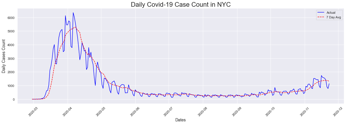
The first visualization is a plot of the total case sound in NYC by date. I also included a second plot which also plotted the 7 day avg. The first thing that we notice for the actual plot is that there are many peaks. The explanation for this is that less testing happens on the weekends so the number of cases drops significantly. We also see that the highest count (6353) occurred in April 6th 2020 and there has been a reduction in the number of cases since then. We also notice a slight uptick beginning in November 2020 which is the cause of recent concerns.
The peak occurred on 2020-04-06 and had a count of 6353
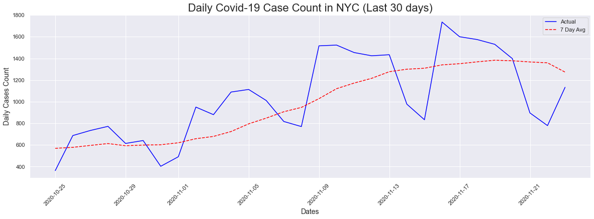
I then decided to look at a 30 day plot for a closer look at what was going on with the new uptick. We can definitely see an upward trend in both the actual counts as well as the 7-day average. In the last 30 days, the cases peaked on 11/16/2020 with a count of 1736.
# Last 30 days
# Cases Plot
fig = plt.figure(figsize=(20,6))
plt.xticks(rotation=45)
plt.title('Daily Covid-19 Case Count in NYC (Last 30 days)', fontsize = 22)
plt.ylabel('Daily Cases Count', fontsize = 14)
plt.xlabel('Dates', fontsize = 14)
plt.plot(dates[-30:], cases[-30:], color="blue", label = "Actual")
plt.plot(dates[-30:], sevendaycases[-30:], color="red", linestyle="dashed",label="7 Day Avg")
#plt.legend(bbox_to_anchor=(1.05, 1), loc='upper left', borderaxespad=0.)
plt.legend()
peakdates(cases[-30:],dates[-30:])
The peak occurred on 2020-11-16 and had a count of 1736
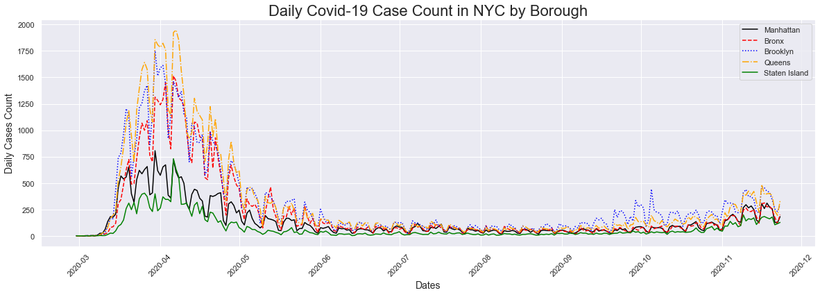
Next I decided to take a look at the cases by borough. Initially this is a very busy plot and its really difficult to differentiate between the different boroughs. In addition, aside from the two peaks on both ends of the plots, its difficult to see what is going on in the dates between them.
# Cases Plot
fig = plt.figure(figsize=(20,6))
plt.xticks(rotation=45)
plt.title('Daily Covid-19 Case Count in NYC by Borough', fontsize = 22)
plt.ylabel('Daily Cases Count', fontsize = 14)
plt.xlabel('Dates', fontsize = 14)
#plt.plot(dates, cases)
plt.plot(dates, mncases, label="Manhattan",color="black")
plt.plot(dates, bxcases, label="Bronx",color='red', linestyle='dashed')
plt.plot(dates, bkcases, label="Brooklyn",color="blue", linestyle='dotted')
plt.plot(dates, qncases, label="Queens",color="orange",linestyle='dashdot')
plt.plot(dates, sicases, label="Staten Island",color="green")
plt.legend()
#peakdates(cases,dates)
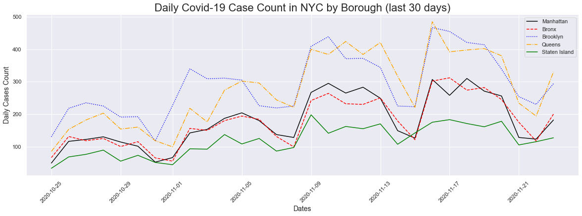
In order to get a better look, I decided to plot cases for the last 30 days. We can get a better look at what is going on in each borough. We can see that as we go from left to right all the boroughs are having an uptick in cases. We can also see that Brooklyn and Queens are increaseing at a higher rate than the others. Manhattan and the Bronx has a lower increase when compared to Brooklyn/Queens, and Staten Island has the lowest increase.
# 30 Day Cases Plot
fig = plt.figure(figsize=(20,6))
plt.xticks(rotation=45)
plt.title('Daily Covid-19 Case Count in NYC by Borough (last 30 days)', fontsize = 22)
plt.ylabel('Daily Cases Count', fontsize = 14)
plt.xlabel('Dates', fontsize = 14)
#plt.plot(dates, cases)
plt.plot(dates[-30:], mncases[-30:], label="Manhattan",color="black")
plt.plot(dates[-30:], bxcases[-30:], label="Bronx",color='red', linestyle='dashed')
plt.plot(dates[-30:], bkcases[-30:], label="Brooklyn",color="blue", linestyle='dotted')
plt.plot(dates[-30:], qncases[-30:], label="Queens",color="orange",linestyle='dashdot')
plt.plot(dates[-30:], sicases[-30:], label="Staten Island",color="green")
plt.legend()
#peakdates(cases,dates)
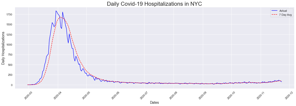
Next we looked at the hopitalizations plot, alongside the seven day average. We see a similar patter to the cases plot, without the uptick at the end as we saw in cases. One thing we also noticed is that hospitalizations peaked a week earlier than cases. I found this a little odd, as early on the only way to get tested was in a hospital.
# Hospitalizations Plot
fig = plt.figure(figsize=(20,6))
plt.xticks(rotation=45)
plt.title('Daily Covid-19 Hospitalizations in NYC', fontsize = 22)
plt.ylabel('Daily Hospitalizations', fontsize = 14)
plt.xlabel('Dates', fontsize = 14)
plt.plot(dates, hospitalizations, color="blue", label = "Actual")
plt.plot(dates, sevendayhosp, color="red", linestyle="dashed",label="7 Day Avg")
plt.legend()
peakdates(hospitalizations,dates)
The peak occurred on 2020-03-30 and had a count of 1835
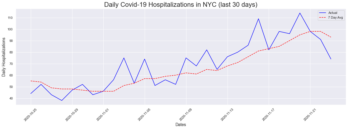
Like with the cases plot, I decided to do a last 30 days plot to see if there was anything going on in the last 30 days. We are also seeing an upick in hospitalizations, which was difficult to notice when you look at the entire timeline beginning in March of 2020.
# 30 Day Hospitalizations Plot
fig = plt.figure(figsize=(20,6))
plt.xticks(rotation=45)
plt.title('Daily Covid-19 Hospitalizations in NYC (last 30 days)', fontsize = 22)
plt.ylabel('Daily Hospitalizations', fontsize = 14)
plt.xlabel('Dates', fontsize = 14)
plt.plot(dates[-30:], hospitalizations[-30:], color="blue", label = "Actual")
plt.plot(dates[-30:], sevendayhosp[-30:], color="red", linestyle="dashed",label="7 Day Avg")
plt.legend()
peakdates(hospitalizations[-30:],dates[-30:])
The peak occurred on 2020-11-20 and had a count of 114
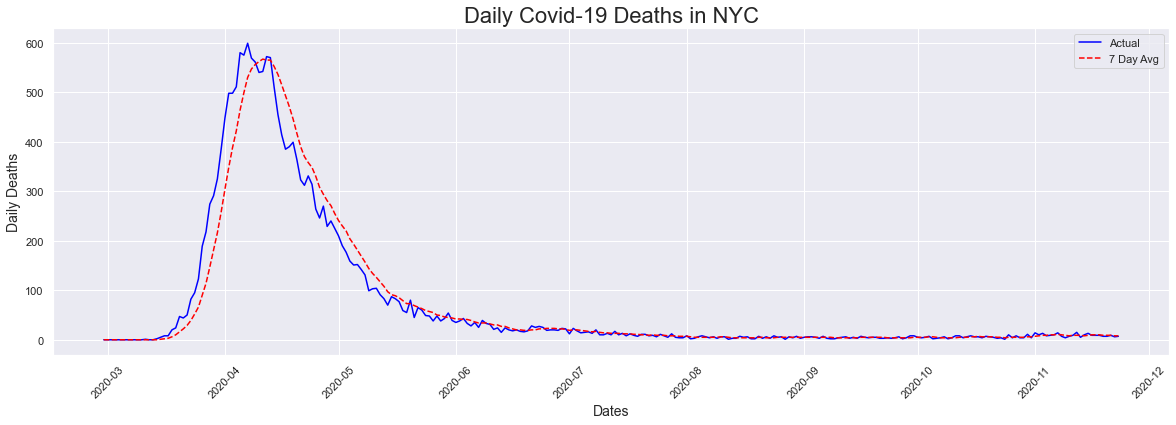
Next we looked at deaths, which peaked a day after the peak in cases. I expected this date to be a little later as death was not immediate after testing positive.
# Deaths Plot
fig = plt.figure(figsize=(20,6))
plt.xticks(rotation=45)
plt.title('Daily Covid-19 Deaths in NYC', fontsize = 22)
plt.ylabel('Daily Deaths', fontsize = 14)
plt.xlabel('Dates', fontsize = 14)
plt.plot(dates, deaths, color="blue", label = "Actual")
plt.plot(dates, sevendaydeaths, color="red", linestyle="dashed",label="7 Day Avg")
plt.legend()
peakdates(deaths,dates)
The peak occurred on 2020-04-07 and had a count of 599
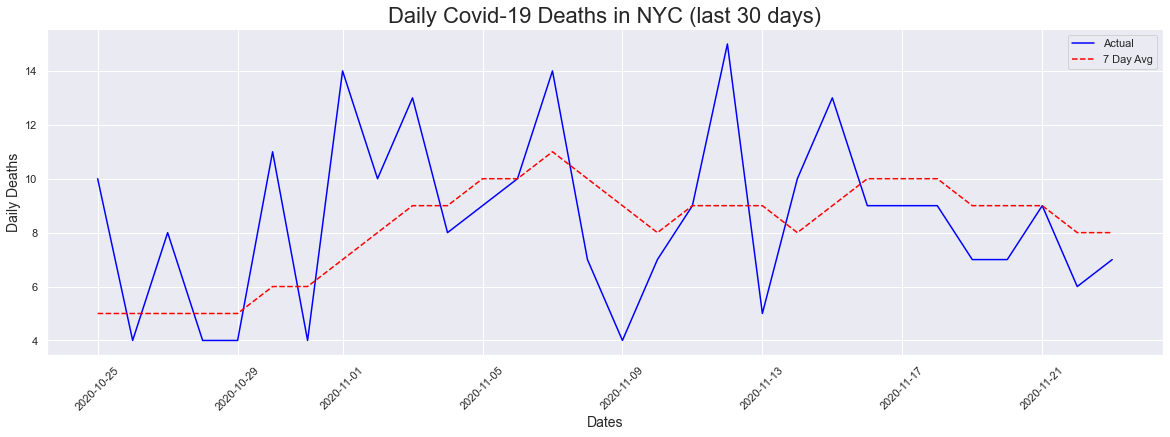
For the 30 day plot, we did saw a range of values but there isnt a visible upward trend like the ones we have seen for cases and hospitalizations.
# Deaths Plot
fig = plt.figure(figsize=(20,6))
plt.xticks(rotation=45)
plt.title('Daily Covid-19 Deaths in NYC (last 30 days)', fontsize = 22)
plt.ylabel('Daily Deaths', fontsize = 14)
plt.xlabel('Dates', fontsize = 14)
plt.plot(dates[-30:], deaths[-30:], color="blue", label = "Actual")
plt.plot(dates[-30:], sevendaydeaths[-30:], color="red", linestyle="dashed",label="7 Day Avg")
plt.legend()
peakdates(deaths[-30:],dates[-30:])
The peak occurred on 2020-11-12 and had a count of 15
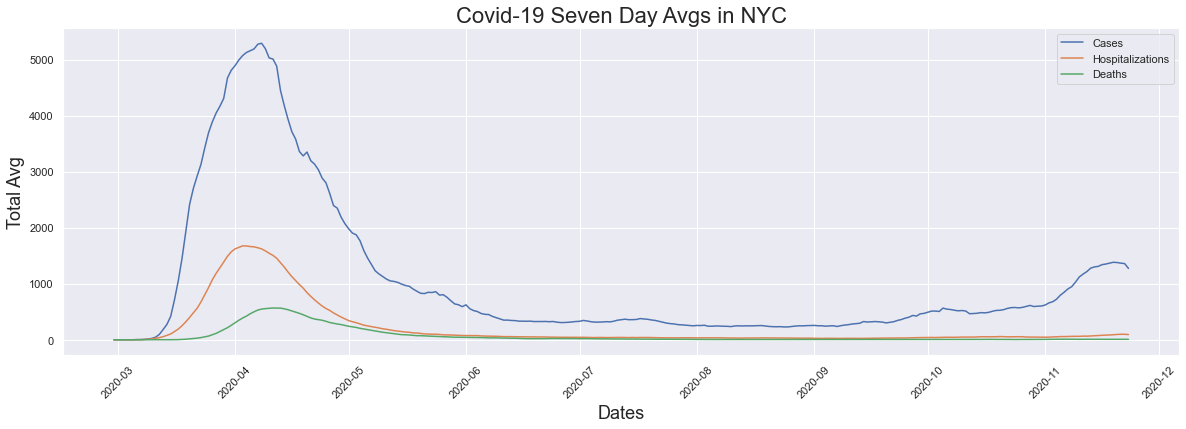
The seven day average is a figure that has been talked about in the news here in New York City when reporting is being done on cases, hospitalizations and deaths. I decided to plot the seven day average for each of those figures for comparison. We see that cases, hositalizations and deaths all had their peaks in early April and eventually we saw the averages come down. We see the flattening of the curve which we heard so much about in the news. In this graph we also see that while hopitalizations and deaths have not had any significant increases, we see a large increase in cases which is what we are hearing about in the news now.
# 7 Day Avgs
fig = plt.figure(figsize=(20,6))
plt.xticks(rotation=45)
plt.title('Covid-19 Seven Day Avgs in NYC', fontsize = 22)
plt.ylabel('Total Avg', fontsize = 18)
plt.xlabel('Dates', fontsize = 18)
#plt.plot(dates, cases, label="Cases")
plt.plot(dates, sevendaycases, label="Cases")
plt.plot(dates, sevendayhosp, label="Hospitalizations")
plt.plot(dates, sevendaydeaths, label="Deaths")
plt.legend()
#peakdates(sevendaycases,dates)
Testing
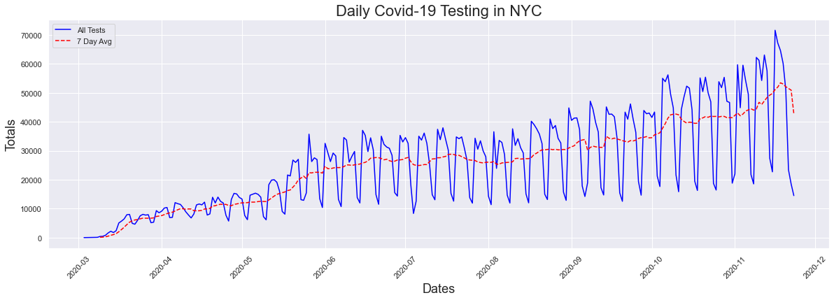
One of the things I sometimes hear is that the increase in cases is due to an increase in cases. In theory, yes if you do more testing you will have an increase in testing. I wanted to explore this to see if there was some truth to this argument that this was the cause of the uptick.
# create df for data on tests
tests_df = pd.read_csv(testing_data)
# turn into a time series
tests_ts = tests_df
tests_ts['DATE'] = pd.to_datetime(tests_ts['DATE'])
tests_ts.head()
| DATE | TOTAL_TESTS | POSITIVE_TESTS | PERCENT_POSITIVE | TOTAL_TESTS_7DAYS_AVG | POSITIVE_TESTS_7DAYS_AVG | PERCENT_POSITIVE_7DAYS_AVG | INCOMPLETE | DAILY_TESTS | |
|---|---|---|---|---|---|---|---|---|---|
| 0 | 2020-03-03 | 15 | 1 | 0.0667 | NaN | NaN | NaN | NaN | NaN |
| 1 | 2020-03-04 | 33 | 5 | 0.1515 | NaN | NaN | NaN | NaN | 18.0 |
| 2 | 2020-03-05 | 65 | 4 | 0.0615 | NaN | NaN | NaN | NaN | 32.0 |
| 3 | 2020-03-06 | 85 | 8 | 0.0941 | NaN | NaN | NaN | NaN | 20.0 |
| 4 | 2020-03-07 | 72 | 8 | 0.1111 | NaN | NaN | NaN | NaN | -13.0 |
Like I previously did for cases, I created some lists to use for ploting and passed the data through the previously created peaks function to find the peak dates. From the graph we immediatly see that yes there has been a significant increase in testing as has been argued. This increase does make perfect sense as initially the only place to get tested was in the emergency room of a hospital. Now, the test can be administered at any doctor's office. This graph also has significant peaks when plotted daily, due to a decrease in testing on the weekends.
# Create Lists for plotting
dates = tests_ts['DATE'].tolist()
testtotal = tests_ts['TOTAL_TESTS'].tolist()
postests = tests_ts['POSITIVE_TESTS'].tolist()
posperc = tests_ts['PERCENT_POSITIVE'].tolist()
seventesttotal = tests_ts['TOTAL_TESTS_7DAYS_AVG'].tolist()
sevenpostests = tests_ts['POSITIVE_TESTS_7DAYS_AVG'].tolist()
sevenposperc = tests_ts['PERCENT_POSITIVE_7DAYS_AVG'].tolist()
# Daily Testing Plot
fig = plt.figure(figsize=(20,6))
plt.xticks(rotation=45)
plt.title('Daily Covid-19 Testing in NYC', fontsize = 22)
plt.ylabel('Totals', fontsize = 18)
plt.xlabel('Dates', fontsize = 18)
plt.plot(dates, testtotal, label="All Tests",color="blue")
plt.plot(dates, seventesttotal, label="7 Day Avg",color="red", linestyle="dashed")
#plt.plot(dates, posperc, label="Percent Positive Results Tests")
plt.legend()
# Peak # of Tests
peakdates(testtotal,dates)
The peak occurred on 2020-11-16 and had a count of 71626
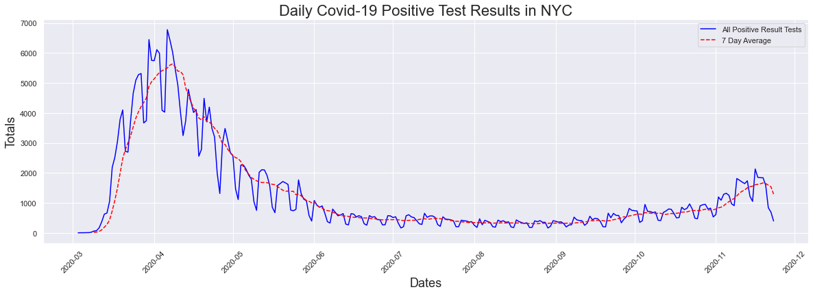
Now what about positive rest results, which is what we called cases? How has that increased with the surge in testing? Lets look at the graph again to refresh your memeory. There has been a recent uptick in cases/positive results but for the most part there was not any increase.
# Daily Positive Tests Plot
fig = plt.figure(figsize=(20,6))
plt.xticks(rotation=45)
plt.title('Daily Covid-19 Positive Test Results in NYC', fontsize = 22)
plt.ylabel('Totals', fontsize = 18)
plt.xlabel('Dates', fontsize = 18)
plt.plot(dates, postests, label="All Positive Result Tests",color="blue")
plt.plot(dates, sevenpostests, label="7 Day Average",color="red", linestyle="dashed")
#plt.plot(dates, posperc, label="Percent Positive Results Tests")
plt.legend()
# Peak # of Positive Test Results
peakdates(postests,dates)
The peak occurred on 2020-04-06 and had a count of 6780
When you plot both testing and cases together (using the 7 day averages), we see a large increase in testing, and not a large one at all in cases. From the looks of this alone, it looks like there is an increase in testing but not much for cases.
# Daily Testing Plot
fig = plt.figure(figsize=(20,6))
plt.xticks(rotation=45)
plt.title('Daily Tests vs Daily Positive Results', fontsize = 22)
plt.ylabel('Totals', fontsize = 18)
plt.xlabel('Dates', fontsize = 18)
plt.plot(dates, seventesttotal, label="Testing 7 day Avg",color="blue")
plt.plot(dates, sevenpostests, label="Positive Result 7 day Avg",color="red", linestyle="dashed")
#plt.plot(dates, posperc, label="Percent Positive Results Tests")
plt.legend()
# Peak # of Tests
#peakdates(testtotal,dates)
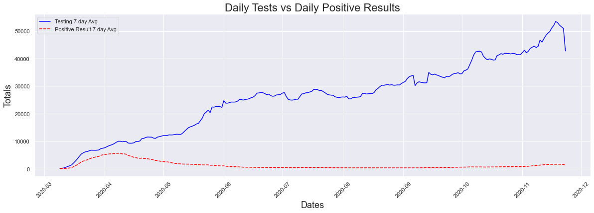
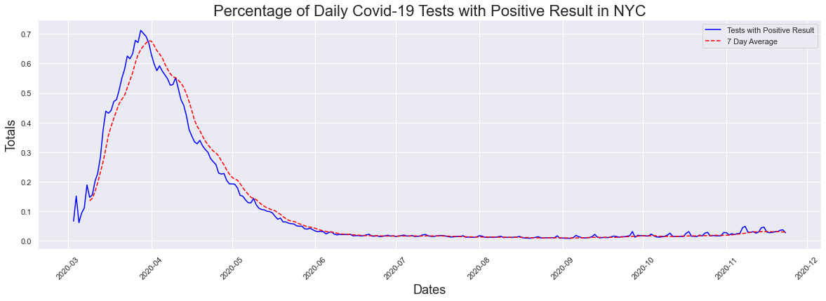
The next question I thought, was is this small increase in cases significant? Maybe there is something we are not seeing my presenting cases and testing alone. For that we looked at the percentage of positive cases graph, and ran the data through the peak dates function. We see that the highest percentage of postive cases occured at the hight of the pandemic. On March 28th 2020 71.17% of those tested had positive results.This does not surprise me at all, as during this time the only way to get tested was to go to a hospital emergency room. In addition, IF you went into a hosital emergency room you were now at high risk of getting covid-19 and now had to quarantine for 2 weeks. FOr the most part, everyone getting tested was someone who was highly suspected of having covid-19 since they were going to the hospital due to having symptoms associated with a covid infection.
# Daily % Positive Tests Plot
fig = plt.figure(figsize=(20,6))
plt.xticks(rotation=45)
plt.title('Percentage of Daily Covid-19 Tests with Positive Result in NYC', fontsize = 22)
plt.ylabel('Totals', fontsize = 18)
plt.xlabel('Dates', fontsize = 18)
plt.plot(dates, posperc, label="Tests with Positive Result",color="blue")
plt.plot(dates, sevenposperc, label="7 Day Average",color="red", linestyle="dashed")
#plt.plot(dates, posperc, label="Percent Positive Results Tests")
plt.legend()
# Peak % of Positive Test Results
peakdates(posperc,dates)
The peak occurred on 2020-03-28 and had a count of 0.7117
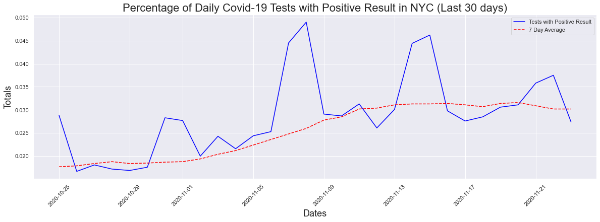
Like in previous examples, it is difficult to see what's happening now so I decided to look at the 30 day graph. We can see that there has been an increase in the past 30 days and the max positive result percentage was 4.9% which is extremely close to the 5% threshold. The max seven day average was 3.16%
# Last 30 days Daily % Positive Tests Plot
fig = plt.figure(figsize=(20,6))
plt.xticks(rotation=45)
plt.title('Percentage of Daily Covid-19 Tests with Positive Result in NYC (Last 30 days)', fontsize = 22)
plt.ylabel('Totals', fontsize = 18)
plt.xlabel('Dates', fontsize = 18)
plt.plot(dates[-30:], posperc[-30:], label="Tests with Positive Result",color="blue")
plt.plot(dates[-30:], sevenposperc[-30:], label="7 Day Average",color="red", linestyle="dashed")
#plt.plot(dates, posperc, label="Percent Positive Results Tests")
plt.legend()
# Peak % of Positive Test Results
peakdates(posperc[-30:],dates[-30:])
print("The max positive result was",max(posperc[-30:])*100,"%")
print("The max positive 7day avg result was",max(sevenposperc[-30:])*100,"%")
The peak occurred on 2020-11-08 and had a count of 0.049
The max positive result was 4.9 %
The max positive 7day avg result was 3.16 %
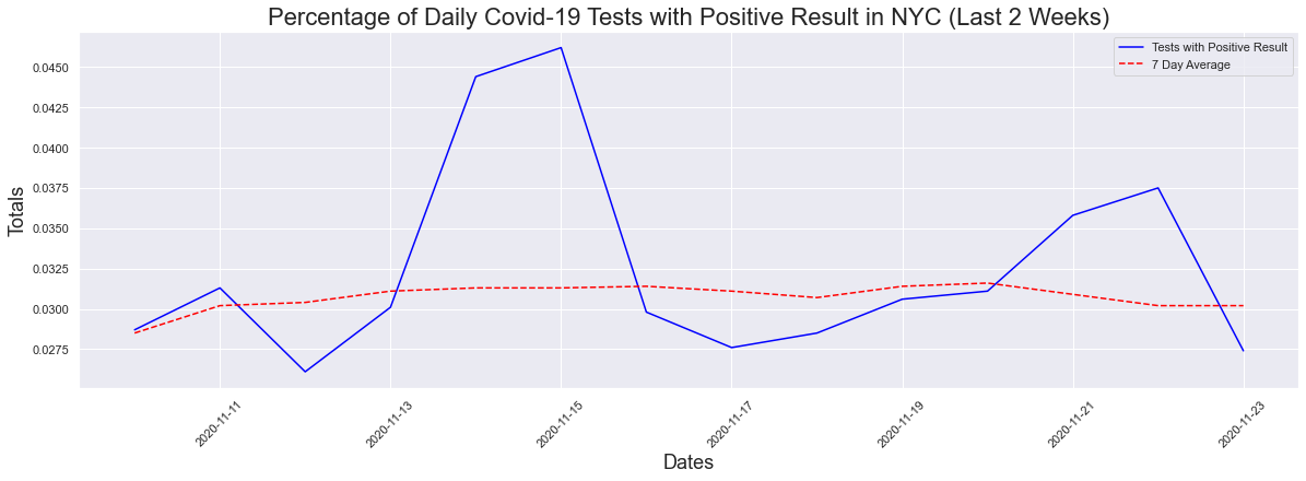
What about the last 2 weeks? One of the stats being used is that the average has to remain below 5% for 14 days. Well when we look at two weeks, there is a slight decrease in the max positive (4.62%) but no change in the seven day average.
# Last 2 weeks Daily % Positive Tests Plot
fig = plt.figure(figsize=(20,6))
plt.xticks(rotation=45)
plt.title('Percentage of Daily Covid-19 Tests with Positive Result in NYC (Last 2 Weeks)', fontsize = 22)
plt.ylabel('Totals', fontsize = 18)
plt.xlabel('Dates', fontsize = 18)
plt.plot(dates[-14:], posperc[-14:], label="Tests with Positive Result",color="blue")
plt.plot(dates[-14:], sevenposperc[-14:], label="7 Day Average",color="red", linestyle="dashed")
#plt.plot(dates, posperc, label="Percent Positive Results Tests")
plt.legend()
# Peak % of Positive Test Results
peakdates(posperc[-14:],dates[-14:])
print("The max positive result was",max(posperc[-14:])*100,"%")
print("The max positive 7day avg result was",max(sevenposperc[-14:])*100,"%")
The peak occurred on 2020-11-15 and had a count of 0.0462
The max positive result was 4.62 %
The max positive 7day avg result was 3.16 %
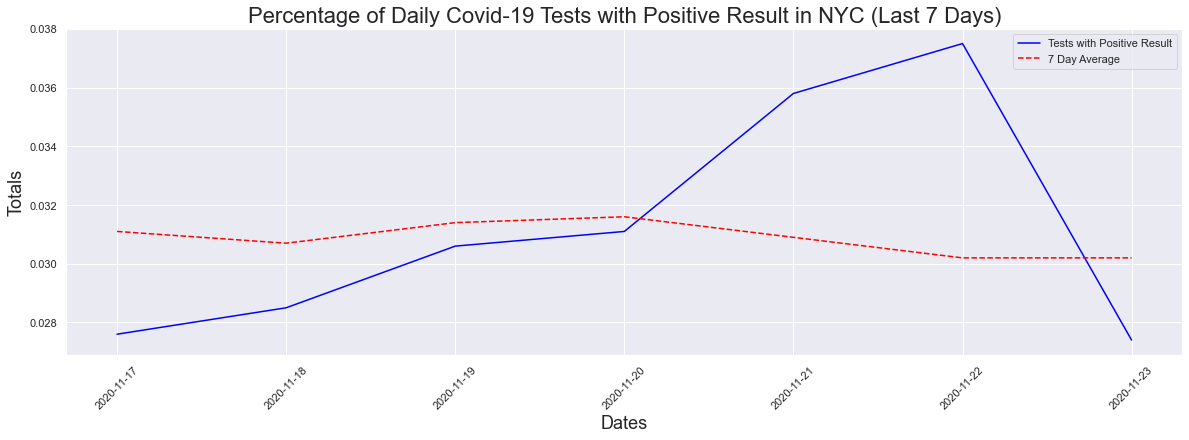
What about the last 7 days? A decrease in the max but not the seven day average.
# Last 7 days Daily % Positive Tests Plot
fig = plt.figure(figsize=(20,6))
plt.xticks(rotation=45)
plt.title('Percentage of Daily Covid-19 Tests with Positive Result in NYC (Last 7 Days)', fontsize = 22)
plt.ylabel('Totals', fontsize = 18)
plt.xlabel('Dates', fontsize = 18)
plt.plot(dates[-7:], posperc[-7:], label="Tests with Positive Result",color="blue")
plt.plot(dates[-7:], sevenposperc[-7:], label="7 Day Average",color="red", linestyle="dashed")
#plt.plot(dates, posperc, label="Percent Positive Results Tests")
plt.legend()
# Peak % of Positive Test Results
peakdates(posperc[-7:],dates[-7:])
print("The max positive result was",max(posperc[-7:])*100,"%")
print("The max positive 7day avg result was",max(sevenposperc[-7:])*100,"%")
The peak occurred on 2020-11-22 and had a count of 0.0375
The max positive result was 3.75 %
The max positive 7day avg result was 3.16 %
Maps
Zip Code Data
# Import Data by Zip Codes
zip_df = pd.read_csv(zipcode_data)
zip_df.head()
| MODIFIED_ZCTA | NEIGHBORHOOD_NAME | BOROUGH_GROUP | COVID_CASE_COUNT | COVID_CASE_RATE | POP_DENOMINATOR | COVID_DEATH_COUNT | COVID_DEATH_RATE | PERCENT_POSITIVE | TOTAL_COVID_TESTS | |
|---|---|---|---|---|---|---|---|---|---|---|
| 0 | 10001 | Chelsea/NoMad/West Chelsea | Manhattan | 581 | 2104.07 | 27613.09 | 28 | 101.40 | 4.26 | 12010 |
| 1 | 10002 | Chinatown/Lower East Side | Manhattan | 1694 | 2248.99 | 75322.71 | 162 | 215.07 | 5.78 | 28866 |
| 2 | 10003 | East Village/Gramercy/Greenwich Village | Manhattan | 899 | 1665.50 | 53977.81 | 35 | 64.84 | 2.96 | 29635 |
| 3 | 10004 | Financial District | Manhattan | 68 | 2287.93 | 2972.12 | 1 | 33.65 | 3.58 | 1901 |
| 4 | 10005 | Financial District | Manhattan | 138 | 1575.84 | 8757.23 | 2 | 22.84 | 3.40 | 3797 |
# Explore Data Types
zip_df.dtypes
MODIFIED_ZCTA int64
NEIGHBORHOOD_NAME object
BOROUGH_GROUP object
COVID_CASE_COUNT int64
COVID_CASE_RATE float64
POP_DENOMINATOR float64
COVID_DEATH_COUNT int64
COVID_DEATH_RATE float64
PERCENT_POSITIVE float64
TOTAL_COVID_TESTS int64
dtype: object
# For the map we weill use later, the properties on the json is a str.
# The modified_zcta also has to be converted from int to str or it will not read properly when this is being mapped
zip_df.MODIFIED_ZCTA = zip_df.MODIFIED_ZCTA.astype(str)
zip_df.dtypes
MODIFIED_ZCTA object
NEIGHBORHOOD_NAME object
BOROUGH_GROUP object
COVID_CASE_COUNT int64
COVID_CASE_RATE float64
POP_DENOMINATOR float64
COVID_DEATH_COUNT int64
COVID_DEATH_RATE float64
PERCENT_POSITIVE float64
TOTAL_COVID_TESTS int64
dtype: object
Mapping
# Import map data
# same as https://github.com/nychealth/coronavirus-data/raw/master/Geography-resources/MODZCTA_2010_WGS1984.geo.json
covid_geo = f'{url}/Geography-resources/MODZCTA_2010_WGS1984.geo.json'
# Open the json file - json.load() methods returns a python dictionary
cvoid_json = json.loads(requests.get(covid_geo).text)
# Map json features
# cvoid_json
# we loop through the dictionary to obtain the zipcodes in the json file
zipcodes_json = []
for index in range(len(cvoid_json['features'])):
zipcodes_json.append(cvoid_json['features'][index]['properties']['MODZCTA'])
# print zipcodes
# zipcodes_json
import folium
# Create Covid Case Count Map
#Create nyc map:
covidMap = folium.Map(location=[40.75, -74.125], zoom_start=10, tiles='cartodbpositron')
# add tile layers to the map
tiles = ['cartodbpositron','openstreetmap','stamenterrain']
for tile in tiles:
folium.TileLayer(tile).add_to(covidMap)
#Create a layer, shaded by COVID_CASE_COUNT:
choropleth = folium.Choropleth(
geo_data= covid_geo, data=zip_df,
columns=['MODIFIED_ZCTA', 'COVID_CASE_COUNT'],
key_on='feature.properties.MODZCTA',
fill_color='YlOrRd', fill_opacity=0.5, line_opacity=0.5,
legend_name='Covid Case Count', highlight=True, smooth_factor=0
).add_to(covidMap)
# add labels indicating the name of the zip code
style_function = "font-size: 15px; font-weight: bold"
choropleth.geojson.add_child(
folium.features.GeoJsonTooltip(['label'], style=style_function, labels=False))
#choropleth.geojson.add_child(
# folium.features.GeoJsonTooltip(['label'], style=style_function, labels=False))
# create a layer control
folium.LayerControl().add_to(covidMap)
covidMap
# Create Covid Death Count Map
covidMap = folium.Map(location=[40.75, -74.125], zoom_start=10, tiles='cartodbpositron')
# add tile layers to the map
tiles = ['cartodbpositron','openstreetmap','stamenterrain']
for tile in tiles:
folium.TileLayer(tile).add_to(covidMap)
#Create a layer, shaded by COVID DEATHS:
choropleth = folium.Choropleth(
geo_data= covid_geo, data=zip_df,
columns=['MODIFIED_ZCTA', 'COVID_DEATH_COUNT'],
key_on='feature.properties.MODZCTA',
fill_color='YlOrRd', fill_opacity=0.5, line_opacity=0.5,
legend_name='Covid Death Count', highlight=True, smooth_factor=0
).add_to(covidMap)
# add labels indicating the name of the zip code
style_function = "font-size: 15px; font-weight: bold"
choropleth.geojson.add_child(
folium.features.GeoJsonTooltip(['label'], style=style_function, labels=False))
#choropleth.geojson.add_child(
# folium.features.GeoJsonTooltip(['label'], style=style_function, labels=False))
# create a layer control
folium.LayerControl().add_to(covidMap)
covidMap
#Create nyc map:
covidMap = folium.Map(location=[40.75, -74.125], zoom_start=10, tiles='cartodbpositron')
# add tile layers to the map
tiles = ['cartodbpositron','openstreetmap','stamenterrain']
for tile in tiles:
folium.TileLayer(tile).add_to(covidMap)
#Create a layer, shaded by COVID_CASE-COUNT:
choropleth = folium.Choropleth(
geo_data= covid_geo, data=zip_df,
columns=['MODIFIED_ZCTA', 'PERCENT_POSITIVE', 'NEIGHBORHOOD_NAME'],
key_on='feature.properties.MODZCTA',
fill_color='YlOrRd', fill_opacity=0.5, line_opacity=0.5,
legend_name='Covid % Positive Results', highlight=True, smooth_factor=0
).add_to(covidMap)
# add labels indicating the name of the zip code
style_function = "font-size: 15px; font-weight: bold"
choropleth.geojson.add_child(
folium.features.GeoJsonTooltip(['label'], style=style_function, labels=False))
#choropleth.geojson.add_child(
# folium.features.GeoJsonTooltip(['label'], style=style_function, labels=False))
# create a layer control
folium.LayerControl().add_to(covidMap)
covidMap
Conclusion
So we've explored the cases, hositalizations and deaths and noticed a few things. Yes there is an increase in the number of cases and it looks like it is trending up. Yes, there has also been a significant increase in testing. One can assume that the reason for the increase in cases is due to the increase in testing, however for this reason we looked at the percentage of tests receiving positive results. When you look at this figure you also see that there is an increase and the percentage is trending up at the moment. Will the number of cases and the percentage of postive test results continue trending up? Time will tell but we can see that we are nearing the 5% threshold. If this continues we can expect to see more precautions being taken such as more restrictions and additional closures. Hopefully that is not the case as I dont know if New York City will be able to handle a second full blow shutdown. I will continue monitoring this and update the information in the project post.
Code
You can check out the full Python code using the following methods:
- Github Page: Francisco’s Repository
- Google Colab:
