Hubway Bikeshare Visualization Project
Visualization of Blue Bike Share Data
This project was a collaborative effort by Antonio Llorens and Francisco Nunez-Fondeur. For this project we decided to visualize the data from the bike sharing platform to get a better understanding about who uses the bikes and for what purpose, as well as how people get around Boston. The main goal is to answer:
Who is using Hubway?
- Who is using Hubway?
- Where is everyone going?
Our target audience is bike sharing customers, company stakeholders, city authorities, academics, data related profesionals.
Background
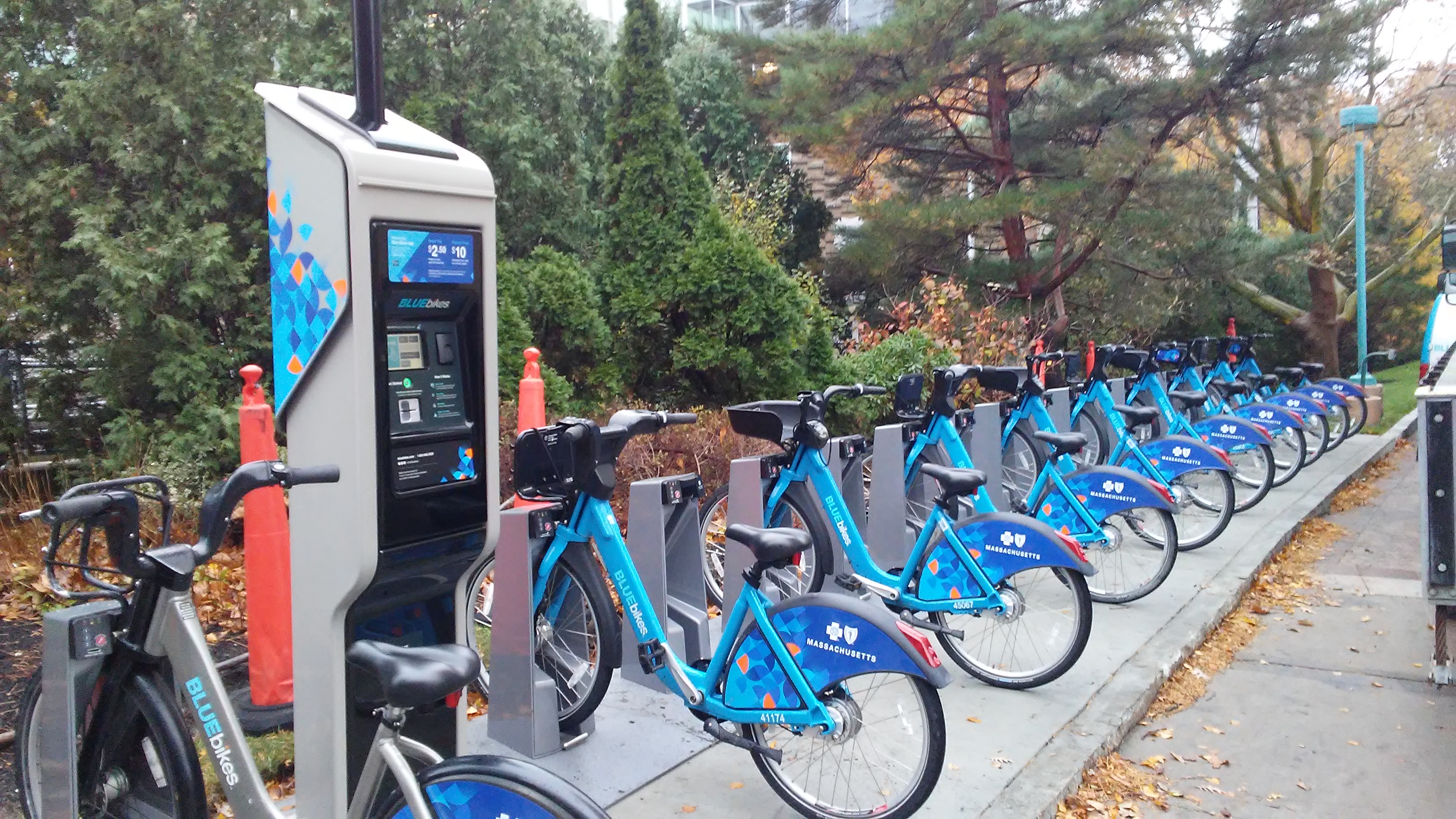
Hubway is a bicycle sharing system in the Boston City area. Since its launch in 2001, Hubway has grown to more than 140 stations and more than 1300 bikes. In 2013, Hubway in parternship with the Metropolitan Area Planning Council, released data from more than a half million trips that were taken on Hubway bikes between its launch on July 28, 2011 until the end of September 2012. In 2018, Hubway was rebranded as Blue Bikes.
Import Libraries & Data
Libraries
Lets import the R packages we will be using
#-----    Install Libraries ----#
#Install leaflet
if (!require(leaflet)) install.packages('leaflet')

#dplyr=
if (!require(dplyr)) install.packages('dplyr')

#Rcolorbrewer
if (!require(RColorBrewer)) install.packages('RColorBrewer')

#ggplot2
if (!require(ggplot2)) install.packages('ggplot2')

#ggpubr
if (!require(ggpubr)) install.packages('ggpubr')

#tidyr
if (!require(tidyr)) install.packages('tidyr')

#lubridate
if (!require(lubridate)) install.packages('lubridate')
Data set
The data set is available from the Hubway Challenge website at the link below:
The hubway trip history data includes:
- Trip duration (in seconds)
- Start time and date
- Stop time and date
- Start station Name and ID
- End station Name and ID
- Bike ID
- User type
- casual = single trip or day pass user
- member = annual or monthly membership (unlimited use)
- Birth Year
- Gender (optional for members, not asked for casuals)
#-----     Importing Datasets            -----#
# Set url link for the location of the dataset
HubwayURL <- "http://files.hubwaydatachallenge.org/hubway_2011_07_through_2013_11.zip"

# Download the .zip file and unzip contents
download.file(HubwayURL, dest = "hubway.zip", mode = "wb")
unzip("hubway.zip", exdir = "hubway")

# Assess the files contained in the .zip file and then import each dataset
list.files("hubway")
hubway_stations <- read.csv(unz("hubway.zip", "hubway_stations.csv"))
hubway_trips <- read.csv(unz("hubway.zip", "hubway_trips.csv"))

#Basic Descriptive Info
str(hubway_trips)
'data.frame':	1579025 obs. of  13 variables:
 $ seq_id    : int  1 2 3 4 5 6 7 8 9 10 ...
 $ hubway_id : int  8 9 10 11 12 13 14 15 16 17 ...
 $ status    : Factor w/ 1 level "Closed": 1 1 1 1 1 1 1 1 1 1 ...
 $ duration  : int  9 220 56 64 12 19 24 7 8 1108 ...
 $ start_date: Factor w/ 521432 levels "10/1/2011 00:01:00",..: 337342 337343 337344 337345 337346 337347 337348 337349 337350 337351 ...
 $ strt_statn: int  23 23 23 23 23 23 23 23 23 47 ...
 $ end_date  : Factor w/ 515102 levels "10/1/2011 00:00:00",..: 333544 333545 333546 333547 333548 333549 333550 333551 333552 333559 ...
 $ end_statn : int  23 23 23 23 23 23 23 23 23 40 ...
 $ bike_nr   : Factor w/ 1164 levels "","A07799","A07800",..: 484 569 472 569 569 472 569 569 569 565 ...
 $ subsc_type: Factor w/ 2 levels "Casual","Registered": 2 2 2 2 2 2 2 2 2 2 ...
 $ zip_code  : Factor w/ 531 levels "","'00210","'00216",..: 523 233 168 176 522 143 199 199 522 104 ...
 $ birth_date: int  1976 1966 1943 1981 1983 1951 1971 1971 1983 1994 ...
 $ gender    : Factor w/ 3 levels "","Female","Male": 3 3 3 2 2 3 2 2 2 3 ...
Creating Interactive Map of Boston Area
Create Boston MBTA Subway Stations Map
An interactive map of Boston’s MBTA Subway Stations was created using
Ray Cha’s Open Transit Data Toolkit
Blue Bikes Station Location Map
A similar map was created using the hubway stations data
Combined Map
Both MBTA & Blue Bikes Station locations were consolidated into one interactive map for comparison. The first thing we noticed is that the northwestern quadrant of the map has very few MBTA Stations. This is clearly an underserved area and we expected to see some high usage of Blue Bikes in this area. The addition of the bike stations added an additional mode of transportation to the downtown Boston area.
Trips Data Preparation
#####-----     Trips Data     -----#####
#--- Main Trips Data ---##
# Total Trips set
  trips <- hubway_trips

# Clean Up
  trips$gender <- as.character(trips$gender)
  trips$gender[trips$gender==""] <- "Unreported"
  trips$gender <- as.factor(trips$gender)
  trips$zip_code <- as.character(trips$zip_code)
  trips$zip_code[trips$zip_code==""] <- "Unreported"
  trips$zip_code <- as.factor(trips$zip_code)

# Create Age Column (Approximate)
  trips <- trips %>%
	mutate(age = 2019-birth_date)

# Basic Stats
  summary(trips)

# Create Casual ONLY Set
  tripscasual <- filter(trips, subsc_type=="Casual")
  tripscasual <- tripscasual[,c(1,2,4:9)] #Removed Unreported Columns (Zip, DOB, Gender)

# Create Registered ONLY Set
  tripsregistered <- filter(trips, subsc_type=="Registered")
Data Exploration
Registered Users vs Casual Users
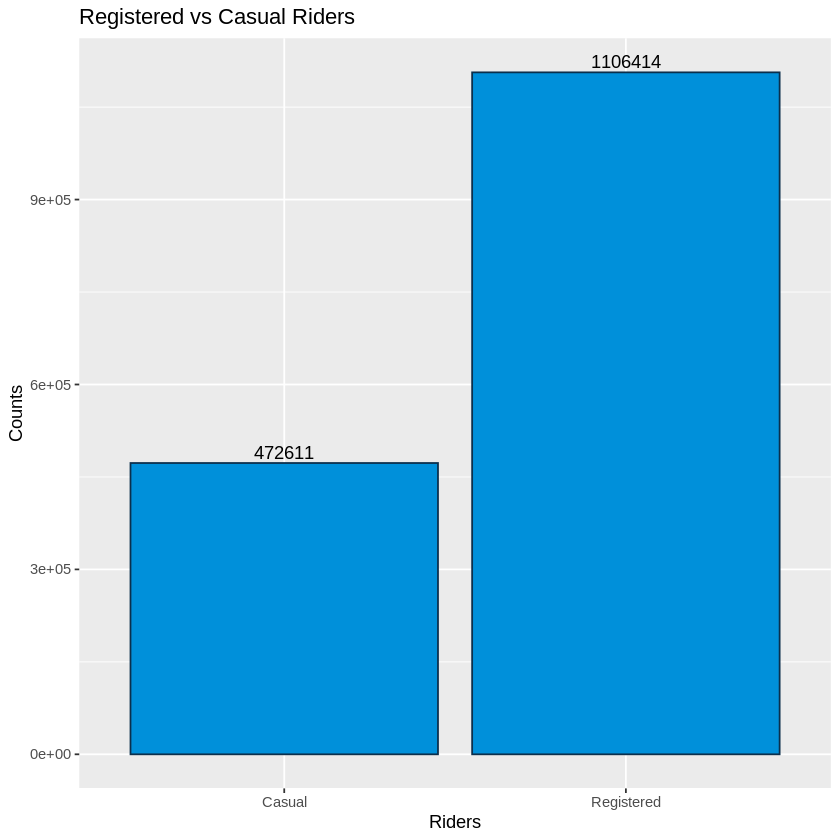
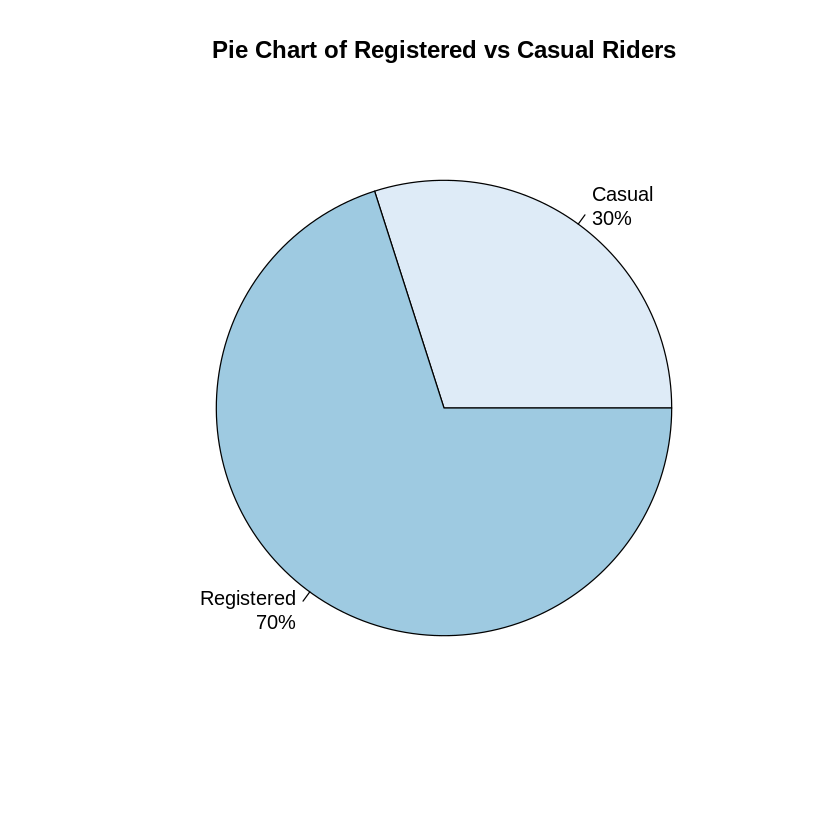
Our first exploration was to look at the registered users vs casual riders (non-registered). We see that 70% of the total riders were registerd users.
 #--- Basic User/Rider Demographics ---#
    # Casual vs Registered
	 ridership <- trips %>%
	   group_by(subsc_type) %>%
	   summarise(counts = n())
	 ridership

	 #Bar Chart
	 ggplot(ridership, aes(x=subsc_type, y=counts, fill=subsc_type)) +
	   geom_bar(stat = "identity", color="#0b2f4c", fill = "#0090DA") +
	   geom_text(aes(label = counts), vjust = -0.3) +
	   ggtitle("Registered vs Casual Riders") + xlab("Riders") + ylab("Counts")
 # Pie Chart version
 regtable <- table(trips$subsc_type)
 regtable <- sort(regtable)
 pct <- round(regtable/sum(regtable)*100)
 lbls <- paste(names(regtable), "\n", pct, sep="")
 lbls <- paste(lbls,"%",sep="") # ad % to labels
 pie(regtable, labels = lbls, col=brewer.pal(2, "Blues"),
	 main="Pie Chart of Registered vs Casual Riders")
Riders by Gender
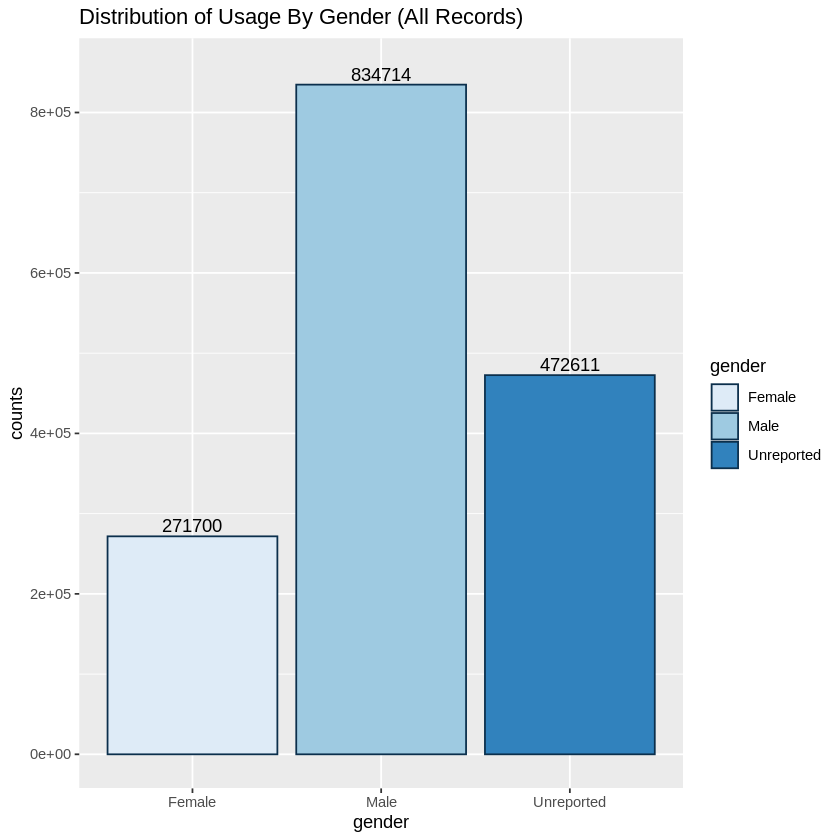
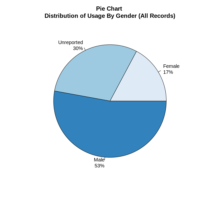
Next we explored the distribution of usage by reported gender. When we looked at all records, we saw that 53% of riders reported being males, 17% female and 30% unreported. We suspected that this was not a fair assessment of gender and it heavily skewed towards unreported due to the fact that gender did NOT need to be reported by casual riders.
# Rides By Gender
# All Records
  gentrips <- trips %>%
	group_by(gender) %>%
	summarise(counts = n())

  ggplot(gentrips, aes(x = gender, y = counts, fill=gender)) +
	geom_bar(stat = "identity", color="#0b2f4c") + scale_fill_brewer(palette="Blues") +
	geom_text(aes(label = counts), vjust = -0.3) +
	ylim(0,850000)+ ggtitle("Distribution of Usage By Gender (All Records)")
  # Pie Chart version
  gendertable <- table(trips$gender)
  gendertable <- sort(gendertable)
  pct <- round(gendertable/sum(gendertable)*100)
  lbls <- paste(names(gendertable), "\n", pct, sep="")
  lbls <- paste(lbls,"%",sep="") # ad % to labels
  pie(gendertable, labels = lbls, col=brewer.pal(3, "Blues"),
	  main="Pie Chart \nDistribution of Usage By Gender (All Records)")
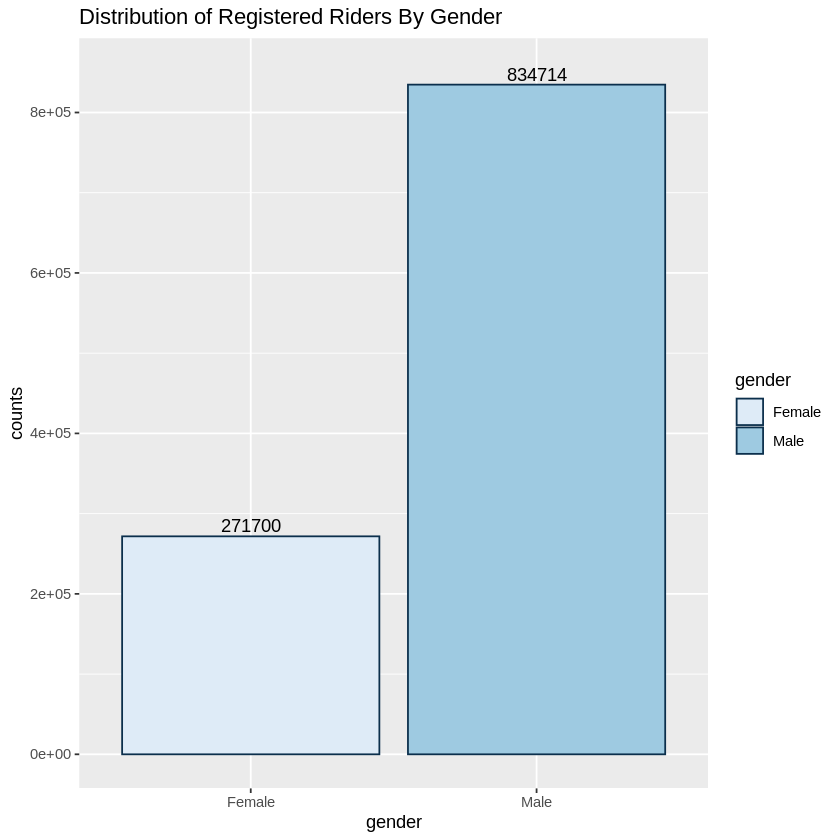
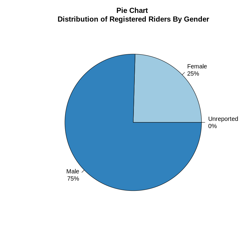
When we looked at just the registered riders, we saw that 75% of the registered riders reported being male, while 25% reported being female. Focusing on just the registred user would eliminate 30% of our data but it would allow us to get a better picture of the riders.
# Registered Users ONLY
  genreg <- tripsregistered %>%
	group_by(gender) %>%
	summarise(counts = n())

  ggplot(genreg, aes(x = gender, y = counts, fill=gender)) +
	geom_bar(stat = "identity", color="#0b2f4c") + scale_fill_brewer(palette="Blues") +
	geom_text(aes(label = counts), vjust = -0.3) +
	ylim(0,850000)+ ggtitle("Distribution of Registered Riders By Gender")
  # Pie Chart version
  genregtable <- table(tripsregistered$gender)
  genregtable <- sort(genregtable)
  pct <- round(genregtable/sum(genregtable)*100)
  lbls <- paste(names(genregtable), "\n", pct, sep="")
  lbls <- paste(lbls,"%",sep="") # ad % to labels
  pie(genregtable, labels = lbls, col=brewer.pal(3, "Blues"),
	  main="Pie Chart \nDistribution of Registered Riders By Gender")
Age Distribution
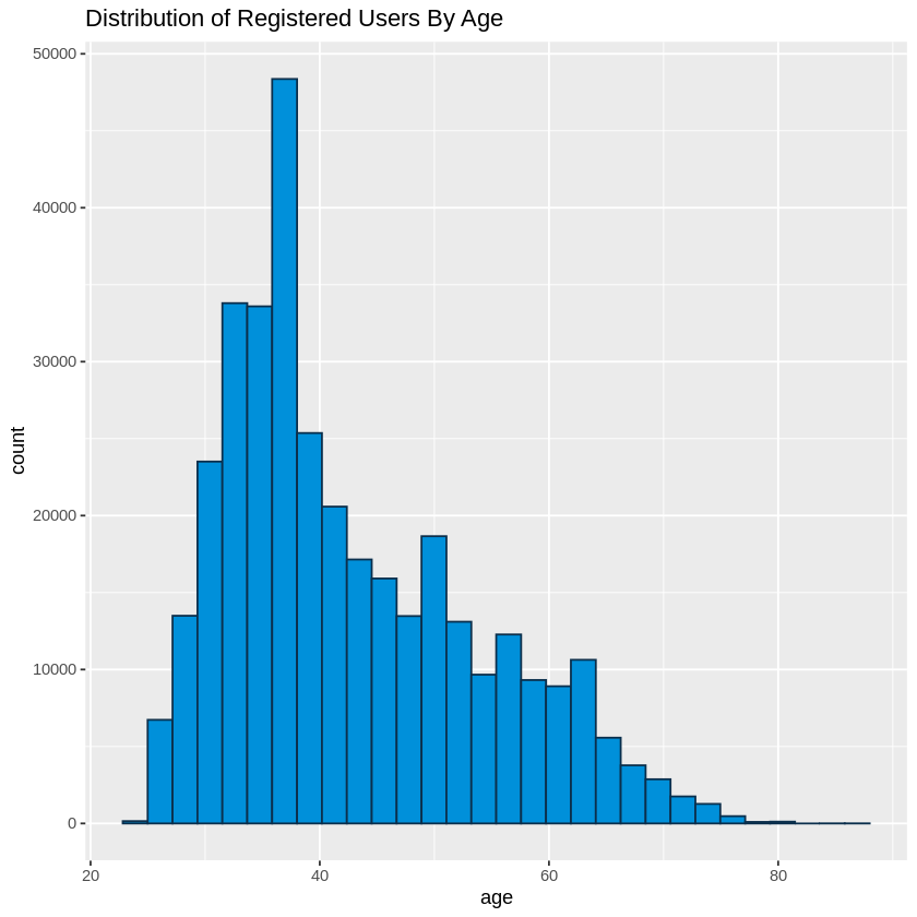
Next we looked at the age distribution. Age was also not a required field for casual riders and thus this information only includes the registered users. A quick look at some statistical information shows us that only 31.69% of registred riders (350,644 out of 1,106,414) reported their age.
Of those that did report their age, the mean age was 42.7 while the median age was 40. 95% of the ridership was between the ages of 34 and 50. The total age range was 24 - 87.
   Min. 1st Qu.  Median    Mean 3rd Qu.    Max.    NA's
   24.0    34.0    40.0    42.7    50.0    87.0  755770
# Calculate Mean of Age
  gendermean <- tripsregistered %>%
    group_by(gender) %>%
    summarise(mean=mean(age, na.rm=TRUE))
  gendermean
| Female | 41.30244 |
| Male | 43.16753 |
# Plot Histogram
ggplot(tripsregistered, aes(age)) +
  geom_histogram(color="#0b2f4c", fill="#0090DA") +
  ggtitle("Distribution of Registered Users By Age")
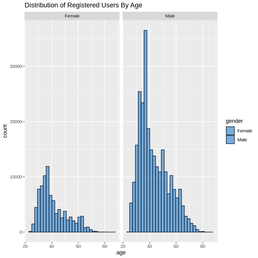
We also wanted to look at the age distribution by gender.
For males, we had a mean of 43.2 and a median of 40. The age range for 95% of the riders in this group was 34 - 51 with an age range of 24 - 58.
For females, we saw a mean of 41.3 with a median of 38. The age range for 95% of the reiders in this group was 33 - 47 with an age range of 24 - 87.
# Distribution by Age and Gender
males <- tripsregistered %>%
  filter(gender=="Male")

females <- tripsregistered %>%
  filter(gender=="Female")

# Summaries
summary(males$age)
summary(females$age)
   Males - Age
   Min. 1st Qu.  Median    Mean 3rd Qu.    Max.    NA's
   24.0    34.0    40.0    43.2    51.0    85.0  571088

   Females - Age
   Min. 1st Qu.  Median    Mean 3rd Qu.    Max.    NA's
   24.0    33.0    38.0    41.3    47.0    87.0  184682
# Plots
ggplot(tripsregistered, aes(x=age, color=gender))+
  geom_histogram(fill="#0090DA", alpha=0.5, position="identity") +
  scale_color_manual(values=c("#0b2f4c", "#FFFFFF")) +
  ggtitle("Distribution of Registered Users By Age")
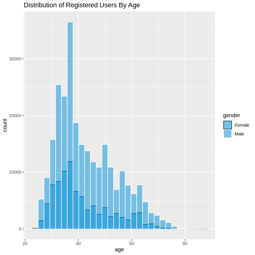
When comparing the age distribution for both genders, we see that the graphs were both right skewed. With a median age of 30 for females and 40 for males.
  ggplot(tripsregistered, aes(x=age, color=gender))+
	geom_histogram(fill="#006AC6", alpha=0.5, position="identity") +
	scale_color_manual(values=c("#0D1D32", "#0D1D32")) +
	facet_wrap(~gender) +
	ggtitle("Distribution of Registered Users By Age")
Trip Duration
Next, we looked at the duration of the trips to see how long riders were using the bikes for. Our initial observations included trips that lasted less than 60 seconds, and even some that somehow were listed as negative. We removed these trips from the set as there were numerous trips that were done for testing purposes and still included in the set. This also included trips were the bikes were originally started but due to reasons known by the rider, the bikes were redocked without actually going anywhere. In addition there were some trips which were noted as lasting over 24 hours. These were also removed from the set as there were other issues reported where a bike would not register as returned or may have been stolen.
#--- Trips Duration (Duration measured in seconds)---#
  # Creating Set and Clean Up
  tripsdur <- trips  %>%
	select(duration, subsc_type, birth_date, gender,age)
  summary(trips$duration)
    Min.  1st Qu.   Median     Mean  3rd Qu.     Max.
   -6900      412      660     1200     1082 11994458
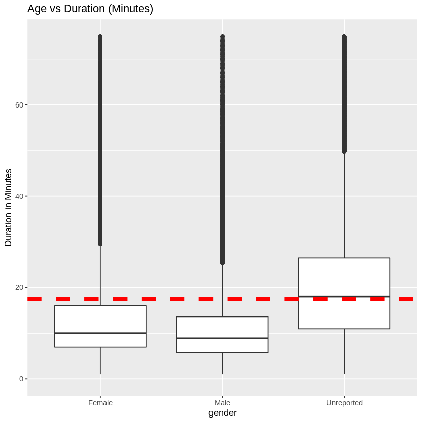
Once the set was cleaned up, we converted the time from seconds to minutes. The median trip length was 11 minutes, with a mean of 17.472 minutes. The duration for 95% of this set was 7 - 18.250 minutes. The range was 1.017 - 1439.550 minutes.
# Clean Up of Outliers
  tripsdur <- tripsdur[tripsdur$duration > 60,] # Remove all trips less than 60 seconds.seconds in length (potentially false starts or users trying to re-dock a bike to ensure it was secure)
  tripsdur <- tripsdur[tripsdur$duration < 86400,] # Remove all trips greater than 86,400 seconds (24 hours)
  summary(tripsdur$duration)
   Min. 1st Qu.  Median    Mean 3rd Qu.    Max.
     61     420     660    1048    1095   86373
# Convert Duration from Seconds to Minutes
  tripsdur <- tripsdur %>%
	mutate(duration=(duration/60))
  summary(tripsdur$duration)
    Min.  1st Qu.   Median     Mean  3rd Qu.     Max.
   1.017    7.000   11.000   17.472   18.250 1439.550
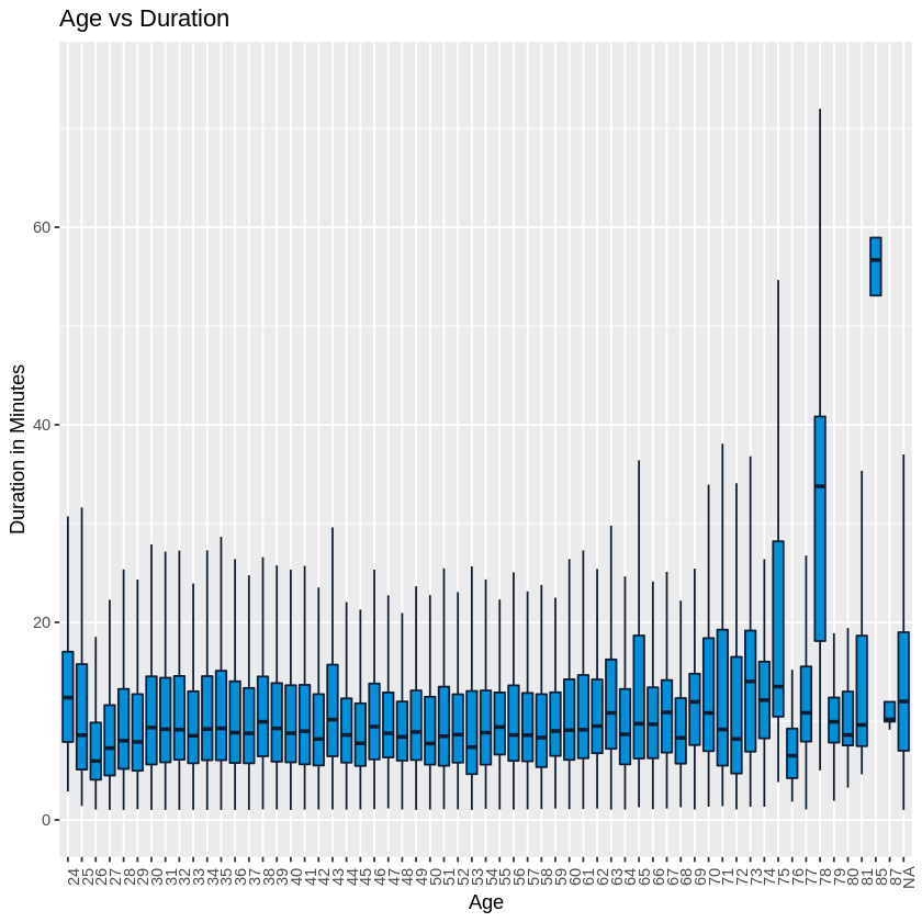
We looked for a relationship between the age and duration of trips. There wasnt much change in the duration by age with the exception of a few of the older users. The trip distances did not vary much.
# Boxplot Age vs duration. Have to convert age to factor
ggplot(tripsdur, aes(x=factor(age), y=(duration))) +
  geom_boxplot(outlier.shape=NA, fill="#0090DA", color="#0D1D32") + #remove outliers
  ggtitle("Age vs Duration") +
  theme(axis.text.x = element_text(angle = 90)) + xlab("Age") + ylab("Duration in Minutes") +
  ylim(0,75)
# Duration by Gender
ggplot(tripsdur, aes(x=gender, y=duration)) +
  geom_boxplot() +
  ylim(0,75)+ ggtitle("Age vs Duration (Minutes)") + ylab("Duration in Minutes") +
  geom_hline(yintercept=(mean(tripsdur$duration)), linetype="dashed",color = "red", size=2)
Day of the Week
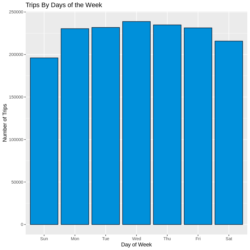
We looked at the days of the week and saw that the majority of trips occured Monday to Friday. There was a drop off in trips during the weekend, particularly for Sunday.
#--Trips over different days of the week and Trips by time of day--#

#Creating Data Frames
trips$start_date <- mdy_hms(hubway_trips$start_date, tz = 'EST')
trips$end_date   <- mdy_hms(hubway_trips$end_date, tz = 'EST')

trips$day_of_week <- wday(trips$start_date, label = TRUE)

#Plot
ggplot(data = trips, aes(x = day_of_week)) + geom_bar(fill = '#0090DA', color="#0D1D32")+
  ggtitle("Trips By Days of the Week")+
  ylab("Number of Trips") +
  xlab("Day of Week")
Time of Day
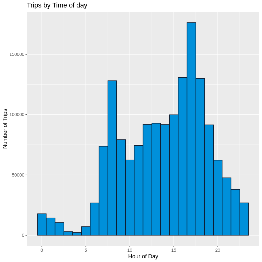
We looked at trips by time of day, we noticed that there were two peaks, one around 8AM and the other at 5PM. When paired with the previous data showing that the majority of trips are occuring Monday to Friday we are predicting that these trips are mostly to and from work locations for the users.
#Plot
trips$hour_of_day <- hour(trips$start_date)
ggplot(data = trips, aes(x = hour_of_day)) +
  geom_histogram(fill = '#0090DA', colour = '#0D1D32', binwidth = 1)+
  ggtitle("Trips by Time of day")+
  ylab("Number of Trips") +
  xlab("Hour of Day")
Top Stations
Lastly, we wanted to take a look at the actual destinations to get an idea of where riders were traveling to during these days/hours. We looked at the data for starting locations as well as the destination.
#--- Popular Destinations ---#
# Popular Trips Set
  poptrips <- trips %>%
	select(start_date, strt_statn, end_date, end_statn, subsc_type, gender, age)
  poptrips$strt_statn <- as.factor(poptrips$strt_statn)
  poptrips$end_statn <- as.factor(poptrips$end_statn)
  poptrips <- poptrips[!is.na(poptrips$strt_statn), ] # remove NA start stations
  poptrips <- poptrips[!is.na(poptrips$end_statn), ] # remove NA end stations
Starting Stations
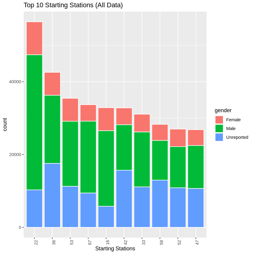
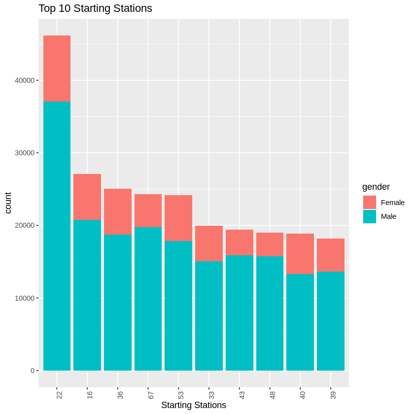
We created a histogram of the top 10 starting stations for all users' data as well as for a set consisting of only registered users. While there was some differences, overall the top 5 stations for both consisted of the same group in a different order. These were stations 22, 36, 53, 67, and 16.
Ending Stations
We created repeated this for the top 10 ending stations, and found similar results as the starting stations (stations 22, 36, 53, 67, and 16). We also saw stations 42 show up in the ending stations top 5 for all data. This is most likely a location that is popular for the casual riders (potentially toursists) but not as comment for registred riders.
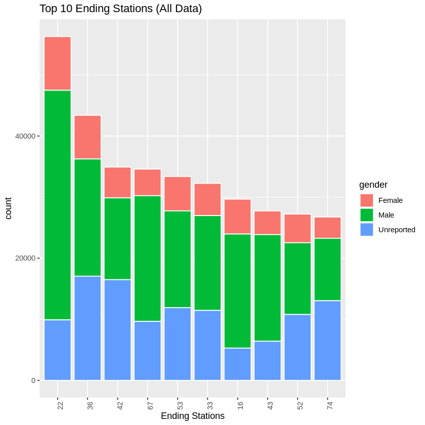
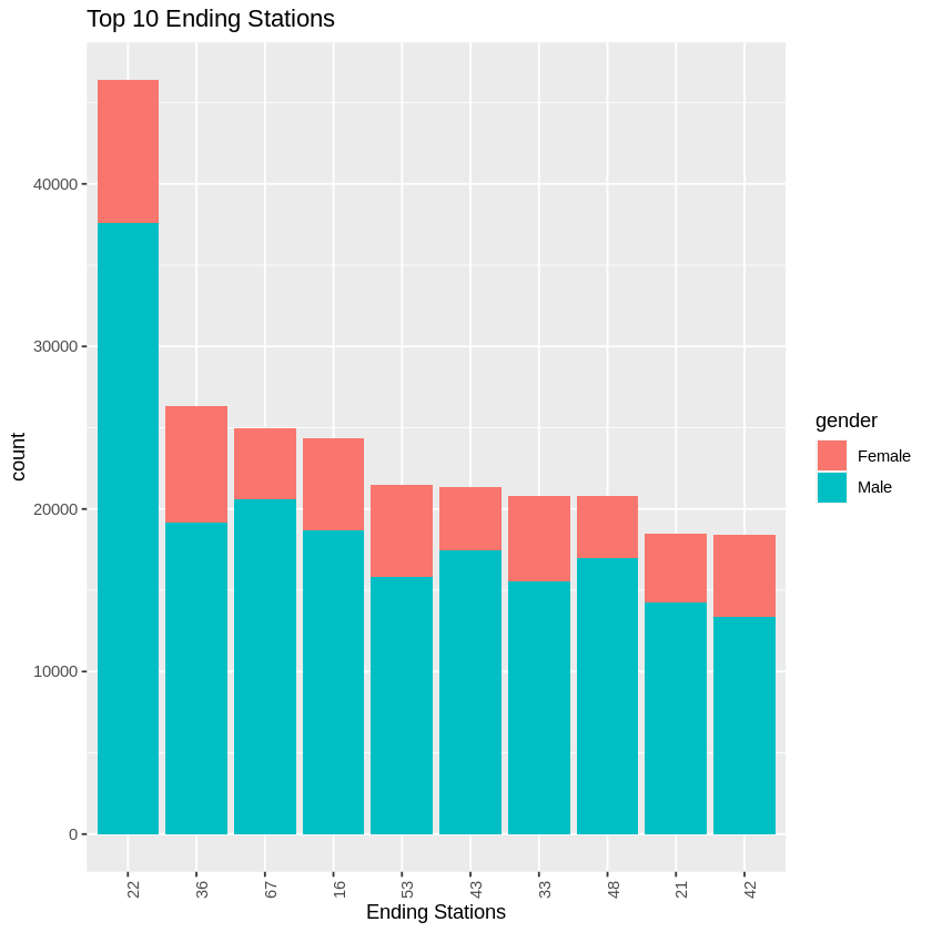
When comparing the incoming and outgoing trips that most were the same locations which indicated that many of these trips were round trips. This lead us to further believe our hypothesis that most of these trips are to and from work.
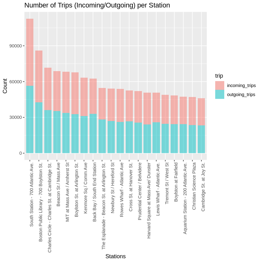
Next we did a little research on some of the most traveled station to get an idea of where and why people were going to these locations. We found the following information:
- Station 22 - South Station/700 Atlantic Ave - Major transportation hub in downtown Boston
- these are most likely individuals taking the subway into the major transportation hubs and then taking bikes from there to their place of employment. Similar behavior is observed in NYC.
- Station 36 - Boston Public Library/700 Boylston - This is the location of the Boston Public Library. Used by students but also a turist location.
- Station 67 - MIT at Mass/Amherst - Nearest station to Mass Institute of Technology (MIT)
- Potentially students, professors and university staff
- Station 53 - Beacon St/Mass Ave - Nearest station to Boston University
- Station 16 - Back Bay/South End - Major transortation hub in downtown Boston
- Station 42 - Boylston St at Arlington - Boston Garden and the Arington Street Church (tourist sites)
Summary
Based on what we the data and the visualizations, we are seeing that from 8AM - 5PM, there is a lot of transportation to and from three major transportation hubs in downtown Boston. We believe these are people coming into downtown Boston for work and taking bicycles to their actual work location. When the work day is over, they are picking up bikes neear theor work of emplyment and returning back to the major hubs. This is why we believe we are seeing so many trips to and from the hubs. This matches with the data showing that the majority of trips being during the work week.
We are also seeing tourist traveling to some tourist destinations, but these they may also be traveling to the major transportation hubs to get around the city.
Lastly, we created a fullsize poster to display our findings to our target audience. We looked into Blue Bikes’s Branding Guidlines to see what fonts and colors the company used in all their materials. We chose those same fonts and color scheme for our visualizations. The full size version of the poster can be downloaded for better viewing by clicking on the link
Full Size Poster
Poster

Code
You can check out the full R code using the following methods:
- Github Page: Francisco’s Repository
- Google Colab:

